
Making your annual report standout
29 Nov, 2019Annual reports serve multiple purposes. First, your company’s financial information is presented in a structured manner. Second, the report acts as a medium for brand promotion. Thirdly, an annual report will be viewed and interpreted by multiple audiences.
An annual report also acts as a company’s collateral brochure. They are an enriching piece of content that tells your company’s story.
The target audience is given a positive and colourful picture of the company’s performance. This makes it imperative for annual report design agencies to adopt certain best practises. These essentials ensure that an annual report delivers its message with maximum impact.
Best practise #1 – Communication design
Although, hiring an annual report design agency is a no-brainer, turning a regular annual report into a stunning piece of communication design is a good practise.
Getting a standout annual report designed inhouse is highly unlikely. A professional annual report design agency can work wonders for the report. The report needs to be creative enough to make an impact on the reader.
The addition of images, infographics, custom fonts, etc. are all aspects of constructive communication design. The visual connection between compelling imagery and last year’s company highlights should be balanced.
Corporate report communication design will also include aspects such as colour scheme, font style, illustrations, schematics, and high-end images. There is a consistency maintained across all collateral.
Best practise #2 – Theme & outline
Every annual report needs to communicate a message. When hiring an award-winning report design agency, companies only provide the agency with raw numbers and chunks of text.
It is up to the design agency to come up with a theme that connects. The key message of a report could be an investment in R&D, leadership change, change in business direction or focussing heavily on financials.
The agency sets a theme and designs an outline for the annual report. The different sections such as the message from the CEO, financial graphs, awards & recognition, case studies, business forecasts, etc. are set in order.
An engaging story is crafted by adding supplementing images, real photos, and crisp content.
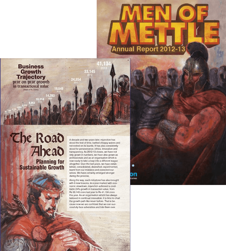
A fantastic example of presenting a report within a theme is the mjunction annual report for 2012-2013. Through graphic storytelling, the message – “When the going gets tough, the tough get going”, was communicated. The report helped restore confidence among their stakeholders.
Best practise #3 – Elevate financials
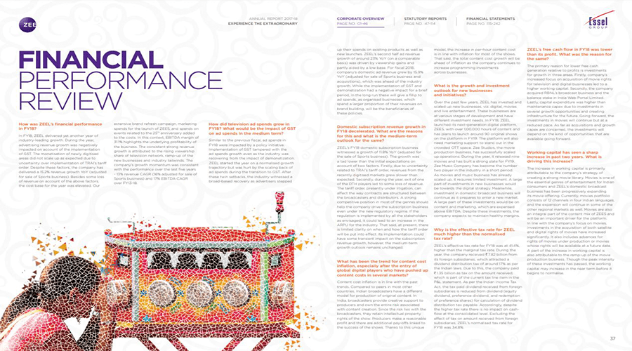
Financials within the report need to be explained, and not thrown at the reader’s face. The report designers always ensure the company’s financial data remains clean.
Numbers within a report can be misinterpreted or found boring. Elevating these financials from figures to easy-to-understand charts is a good practice.
Showcasing revenue figures through smart visuals piques the reader’s interest. Sometimes adding a summary to interpret finance metrics also works.
Best practise #4 – Minimalism is more

Readers are people. They are smart enough to understand the content by simply reading the caption or headline. Create headlines that grab attention. The reader must get an idea of what the section is going to address.
Report design experts will design sections that progress as a story. The report must not look like a long-form article.
Minimal information can also be imparted through call-outs. Call-outs can be rallying cries for employees to improve their performance.