
Improving annual reports visually
16 Dec, 2019It’s the annual report season. A lot of effort goes into gathering data that goes into an annual report. This data is a combination of figures, statistics, and text.
With data this complex, there is a possibility for misinterpretation. A part of the annual report audience won’t even understand what the numbers mean.
With all the effort and resources that go into the making of the report (this includes the time and money spent on a design agency), the report has to be effective.
Data visualization as a solution
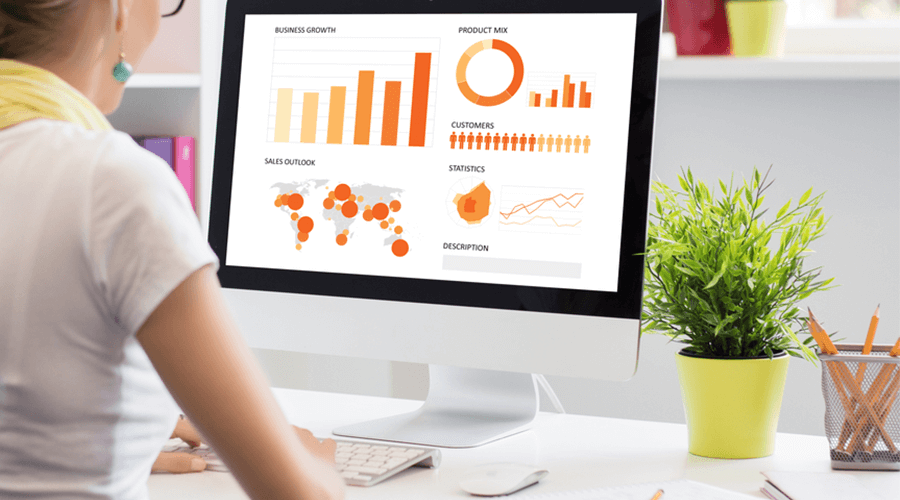
The best solution for making financial data relevant is through data visualization. Quite simply, data visualization integrates numbers and statistics into a visual story. Data visualization makes complex data look simple to understand.
Pages of numerical data repel audiences. But, the same data, packaged as a visual story retains the same audience. Award-winning annual report design agencies use data visualization to transform the way a user sees data.
Seeing is believing. The human brain processes images faster than generic text or numbers. Annual report designers benefit from this behaviour, turning data-filled annual reports into impactful pieces of business storytelling.
What is data visualization?
Data visualization is the representation of data, using graphics. The graphics or images, together, manage to communicate a message, that is usually concealed from the viewer.
Data visualization combines design aesthetics and ease of comprehension. The overall objective is to grab the viewer’s attention. Design principles such as usage of space, colour gradients, custom icons, typography, etc. are adopted within data visualization.
Data visualization is not adopted randomly. The visual objective supersedes the need for creativity. Therefore, experimentation with visual elements needs to be done carefully.
Data storytelling is an important tool. Every business relies on data. The only way this data can be presented in a manner that connects with its readers is through data visualization.
Data storytelling helps reveal interesting insights from that data. Strong data storytelling follows a strong narrative and guides the reader through the content.
Once a narrative is set, the next step is to choose an appropriate visualization element. This can either be a chart or a table. A tableau visualization works great for most annual reports. This type of data visualization condenses multiple pages of data into a single section. This also reduces the overall size of the report.
Interactive data visualizations can be revised or updated easily. This means updating the previous year’s annual report visualizations with new data. Annual report design experts apply design principles to visual elements such as shapes, sizes, and colour. For example, the number of slices on a pie chart or the distance between bars on a graph, etc.
The final aspect is staying true to the visual language. The audience consists of investors, stakeholders, employees, and the general public. Every piece of the visual element needs to follow a brand style.
Audience comprehension and design consistency can only be achieved by staying true to the guidelines.
Only an award-winning report design agency can design engaging annual reports that adopt strong design principles and data visualization.